After the club became independent of the M.V.T, it became obvious that the club would need a new name and logo.
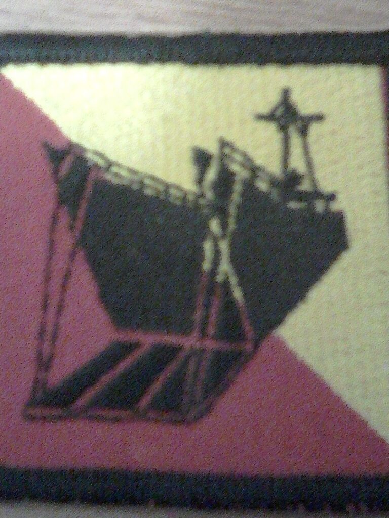
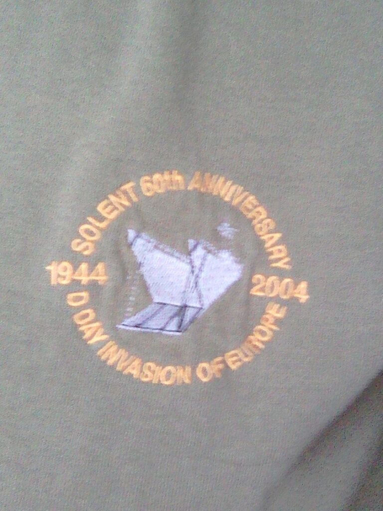
It was suggested by the late Chris Davies that we use the picture of a landing craft with the front open and the committee agreed to give this a try, which was fine until someone pointed out that it was what was used on road signs in France to direct traffic to the landing beaches, so we had to think again.
We asked the members for suggestions for a name for the club and a few were suggested. Martin Hunt, who was on the committee at that time, said that we are Solent area and we get our funds from the Overlord show so how about ‘Solent Overlord’ as a name. We all agreed on this, but on thinking about it, it seemed a bit short to me. I remembered the late Tony Coward, a one time chairman, saying more than once, that the club was run by an executive committee, so I suggested to the committee to add this to our new name and this is how our name came about, but we still needed a logo.
No more suggestions came forward so I took it upon myself to deal with it. At the time we had members that had served in all of the three services (army, navy and airforce) this is represented in the combined ops shoulder flash but we could not just use that as it is, so I had a chat with some people that know more about these things than I, and I was advised not to copy it but to make alterations, so I changed the colour from red to yellow and the shape from round to square and added the letters S O E. and that is how it has always been.
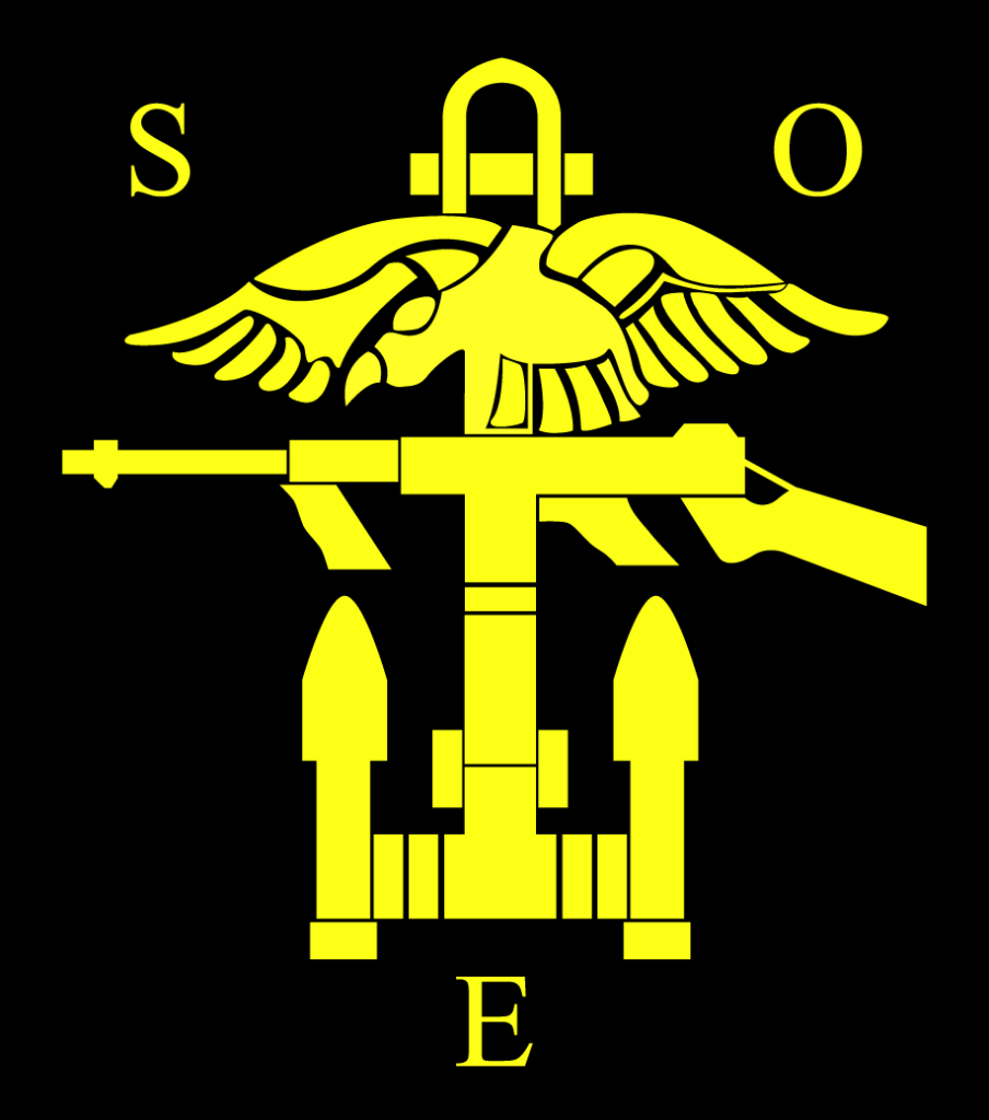
Some years later I noticed that the naval flash is yellow but it is oblong or tombstone shaped. A couple of members took exception to the use of S.O.E, they said that it downgraded the wartime organization, until Richard Notton (former chairman) printed out from the web an A4 list of firms and companies using it.
I am very pleased to see our logo is being maintained in its original form, by our chairman and committee and by Nina our newsletter editor. There have been a couple of attempts to change it but this should not be allowed. It has served us well for many years. On the principal, if its not broke don’t mend it.
Webmaster Note: The Club logo was ‘remastered’ in 2017 into a vector graphics format.
